
“Who Reads the Watchmen” AKA Nonverbal Semiotic Analysis
Watchmen was the first “Graphic Novel” that gave me a different outlook on the medium that I had previously classified as “Comic Books”. Beforehand all the stories I had come across with similar signifiers as the standard comic book format, would have signified to me the basic superhero tale. Something out of this world and not connected to my semiosphere of reality. Though initially I was drawn to this novel because of the striking cover, I found myself glued to the story presented. Watchmen is one of the most engaging tales and after reading the final page, you have a deeper understanding of the simple cover on the front of the book.
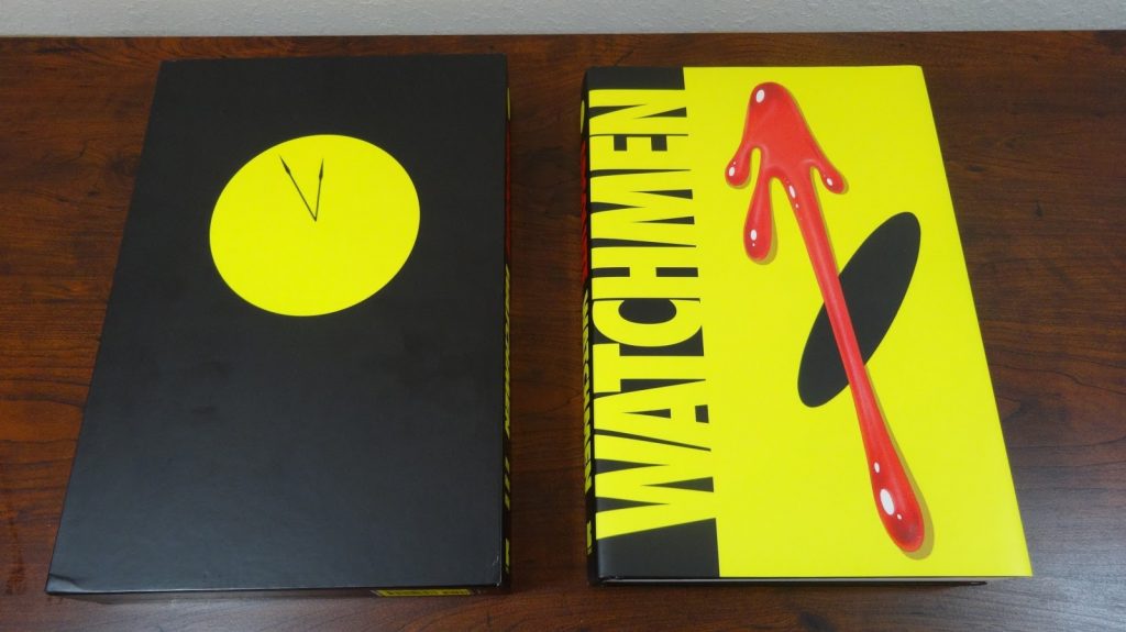
The specific text to be analyzed is the front cover of the Watchmen graphic novel “Absolute Edition” book sleeve. Though this set came with multiple pieces, this analysis will be primarily focused on the front cover of the main text. The medium of the text is a literal a book cover sleeve, the channels it’s associated with are tactile, and linguistic. Though there are familiar visuals with other mediums this report will only be looking at the cover in this specific context and medium. Note this report will primarily be doing a Saussure Method [Signified + Signifier], I will make note of any analysis done with the Pierce Method.
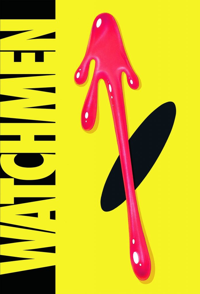
The text consists of five groups of signifiers; two flat colours (Black and Yellow), many shapes including ones almost being strings of literal text “Watchmen”, a black ellipse, and a red custom shape. Together these separate pieces make up a very familiar visual to a reader even if they haven’t read the novel. The simplest signified meanings are for the shapes and colours of black and yellow. The implied meaning is the title of the book and the main content. One could argue what stands out more between the “background” and the red shape, but the major connections to the story are of close visual weight showcasing their importance. Note that the word “Watchmen” is actually made up of extending shapes out of a yellow flat square. With the low level of abstraction and the gestalt method, the signified for most people would be an English or character-based language.
The opposite of the text is a black ellipse that looks simple but has multiple signified meanings. The biggest implied signified is another signifier, that being the smiley face. This smiley face has multiple signified meanings, but the use here is most likely a reference to a time period and mindset, and as well as the recognizable nature. (When Watchmen was released, graphic novels let alone comics were not considered on the same level as literary novels). The “Cherry on Top” both in a placement sense but also in the signified sense, the red custom shape is a very contrasting but eye-catching visual. To a new reader the implied signified, on the visual level, is a blood drop. A deep “lizard brain” signified is that something is wrong, more specifically someone is of physical harm or that blood has been shed. The fact that the blood drop is the only complete signifier is a signifier in itself. It implies that the only thing you know “fully” about this story is that “blood” has been shed. One should also take note of the lack of some common signifiers for the nature of the medium. I will explore this and other things “missing” in the next section.
The semiosphere that this text exists to me is a signifier itself, in that it is often considered to be something more than a comic, and sometimes more than a novel. It helped define and cement “Graphic Novel” as a category and as a semiosphere. It is one of the most influential graphic novels, that has influenced countless mediums outside of its own semiosphere. The text constructs a reality that enforces the internal story over external forces. The text positions itself against others by not following the normal format and routine of other products and stories. It does this by excluding staples that are expected or commonplace for others in the same semiosphere or similar. By not including the writer or artist on the front of the text it implies that the content is more important than the people who created it.
The group of shapes that represent the titled string text “Watchmen” are displayed on a vertical plane, going against the standard format of a horizontal title. By going against the standard, it again positions itself to say that other stories are “normal” and that the “Watchmen’s” story is one that is flipped on its head. Not including any numbers or dates create a sense of timelessness for the story which is taken away on others by including it. There is also some unique positioning between the text and books and comics. Books often position themselves against other mediums or competition by the visuals of the cover, a subtle cover and a standard format for type speaks to a professional and structured story. I would argue that this text uses this positioning to better position itself. The high contrast colours and use of visuals show that the story presented is more than just words or pictures on a page, and on the same note it positions itself against others by creating a reality that asks a text to be more than the medium it is contained in.
I personally believe that everyone, regardless if they are a fan of comic books or not should read Watchmen. If you are into comic books and DC specifically, they are introducing some very interesting stories that connect to it (No Spoilers). It is well written and some of the philosophical questions posed are something everyone should take in. The hardcover edition is not required to experience the story, pick up the softcover collection, check your local library or digital service. There is a great animated version of the novel on YouTube that I have included at the end for the more visually inclined.